Rebrand
ABOUT THE PROJECT
GMAC Home Services had grown through the acquisition of regional real estate companies—Carlson in northern New England, Hammond in greater Boston, Kinlin Grover on Cape Cod, Koenig & Strey in greater Chicago, Pacific Union in greater San Francisco—assembled into a national company focused on the premium and luxury markets. The acquisitions captured those regional names—and then buried them. What remained was the GMAC brand: a visual identity developed decades earlier for the mass-market automotive finance industry, now asked to represent premium residential real estate in five distinct markets across the country.
The dissonance was immediate. The company’s agent population shrank. Sales followed.
We began working with the CMO to understand what had actually gone wrong—and what the company essentially was beneath the brand it had inherited. The competitive landscape at the time was dominated by two conventions: unfounded claims of category leadership (“We’re #1”) and marketing that made agents the stars. The logic behind agent-centered marketing was understandable. Real estate agents are independent contractors, free to move to whichever company will attend to them most. Putting them at the center of the brand was a way of attracting and keeping them. It was also, we came to understand, a fragile and fundamental mistake. An agent-centered brand had no hold on customers, and therefore no actual sustainable pull with agents, either.
Together, we identified the core insight that reoriented everything: the purchase or sale of a home is one of the most emotionally and financially significant moments in a person’s life. A decision of that magnitude deserves more than self-interest from its real estate brand. We developed the belief that if we built a brand customers genuinely wanted—that spoke to the meaning and aspiration of home rather than the credentials of the agent—the customer would come, and the agents would follow. It was a direct inversion of the industry’s operating model. And it worked.
The brand platform we built from that insight centered on the positioning line we wrote: Live the Way You Dream. The line gave both audiences—customers and agents—a reason to believe in the company. It focused the brand on the customer’s experience—on home as the place where the life someone wants is actually lived—and also on the agent’s experience—on GMAC Home Services as the brand they would love to represent.
The most unexpected decision was also the most important one. Those regional names—Carlson, Hammond, Kinlin Grover, Koenig & Strey, Pacific Union—had real equity in their markets, built over decades. But the acquisition had erased them in the interest of national consistency. Together with the CMO, we rallied to bring them back. A customer in San Francisco cared very little about what the same company might be doing on Cape Cod. The desire for corporate uniformity had sacrificed the very thing that made each regional group trusted and known. Once this decision was agreed to, we designed an identity system capable of holding all five names as distinct entities while simultaneously collecting them under a common visual language—individual in market, coherent as a whole.
The yard sign was treated as a primary design opportunity. In residential real estate, the sign on the lawn is the most ubiquitous brand touchpoint in existence—planted in neighborhoods, visible to everyone passing, present at the moment of both sale and purchase. Getting it right was not an aesthetic consideration. It was a strategic imperative. New, architectural office signage design completed the sign program.
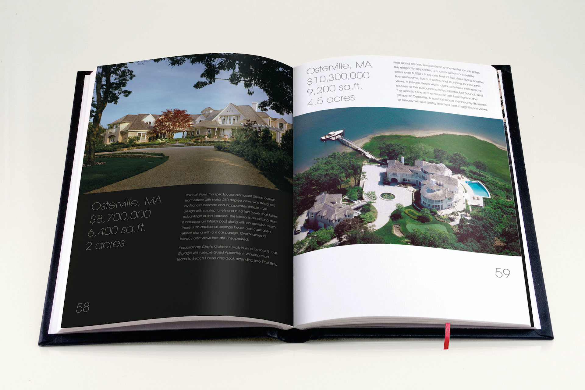
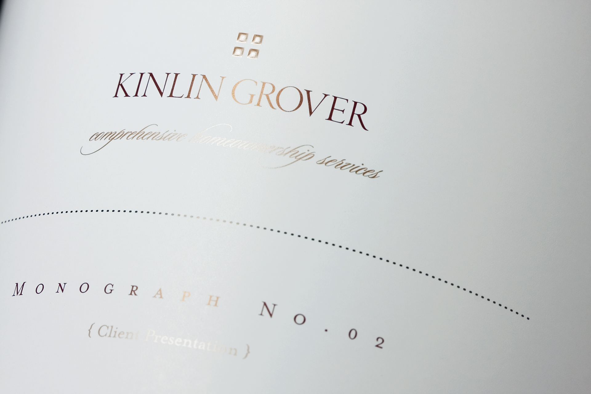
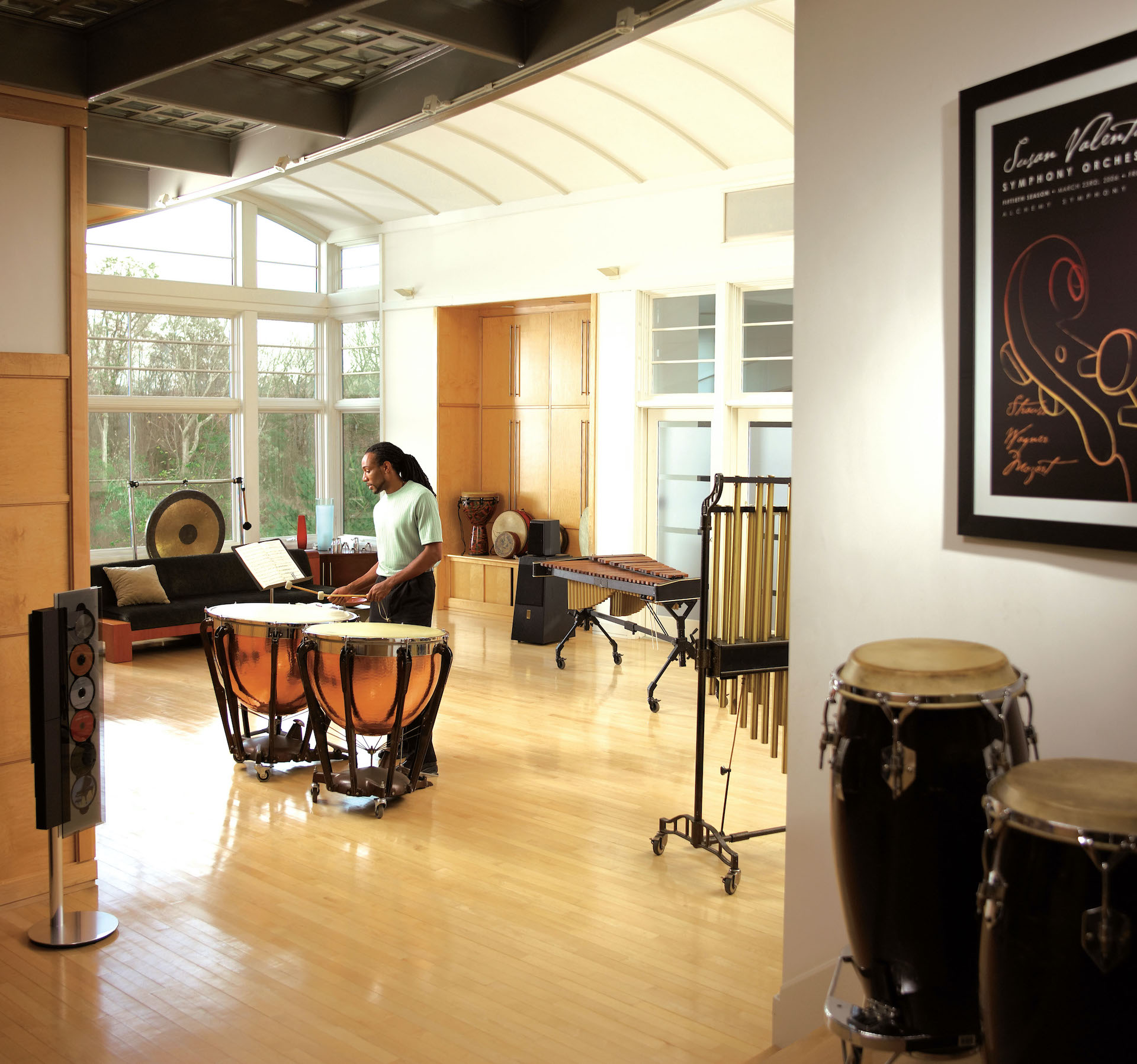
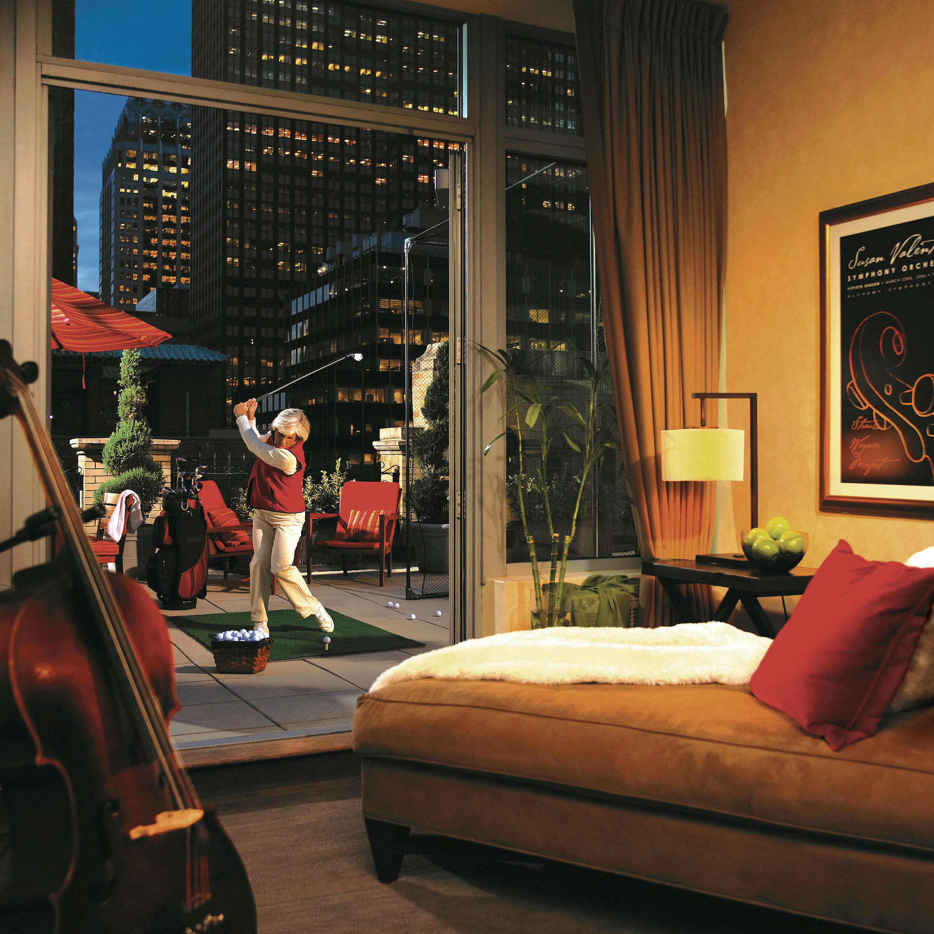
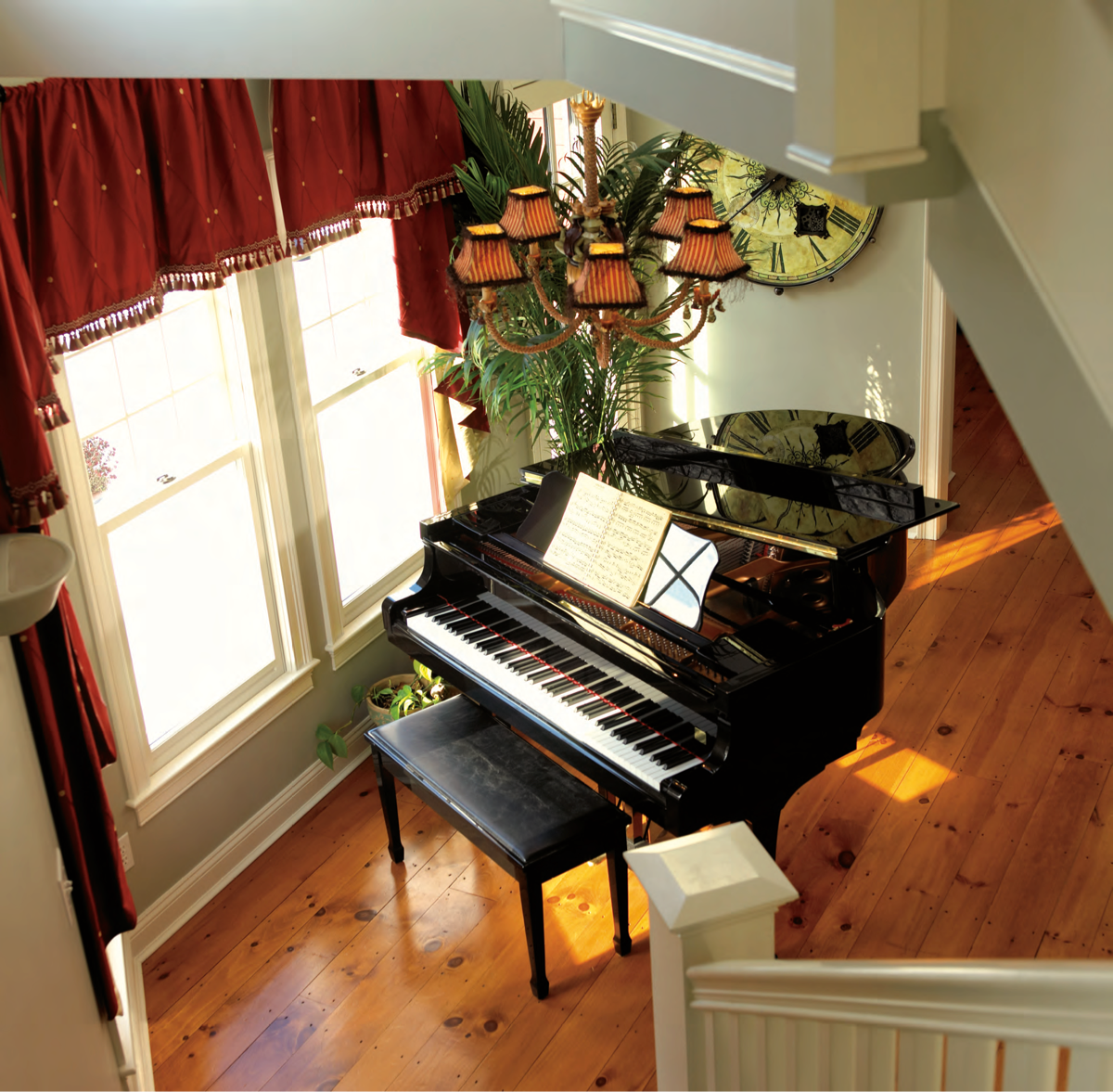
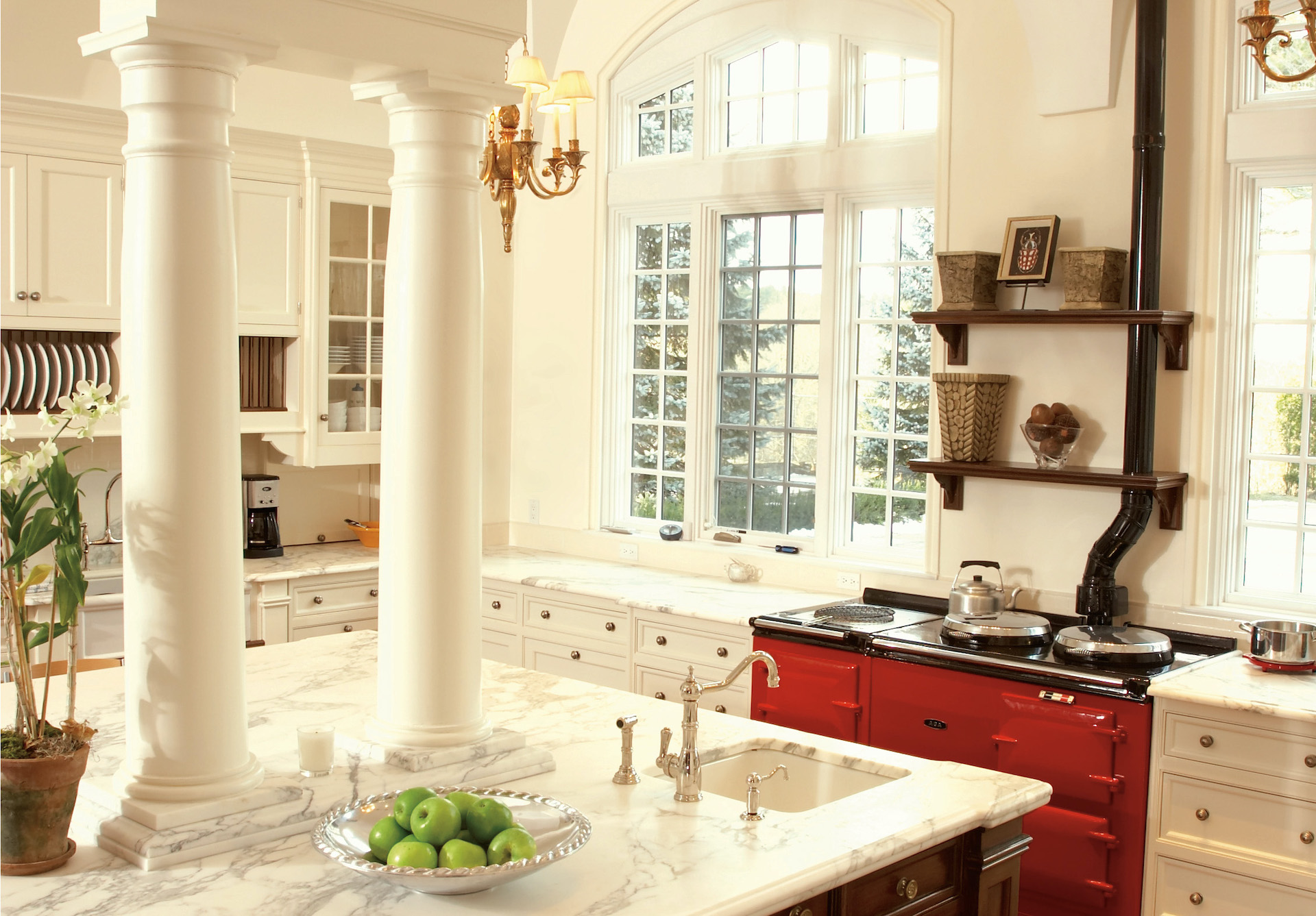
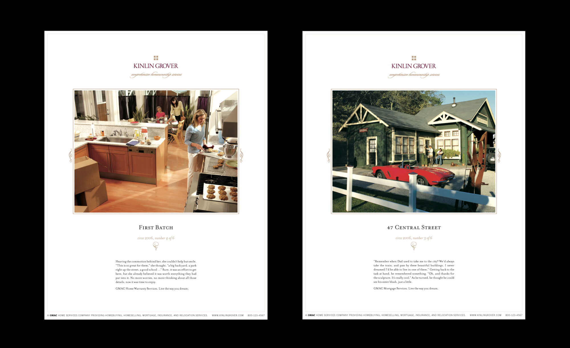
The campaign work that brought the brand to life was produced at full national scale: a crew of more than sixty people, assembled and directed across multiple cities and towns. Custom photography and iconography were developed for the full range of brand materials, including customer brochures and listing presentations. We established a new voice for the brand, and wrote all of the materials. We designed a new company website that established a common platform across all five regional markets. And our brand standards governed the system's implementation and ongoing care, including color and typographic specifications, photography guidelines, and signage placement, ensuring the brand stayed coherent as it reestablished its presence across five markets.
Following the rebrand, GMAC Home Services recovered from its sales losses, rebuilt its agent population, and recaptured its market share. The brand that had been built for customers had done exactly what we believed it would—given agents a reason to stay.

Corporate Logo
Tagline

Division Logos

Custom Icon Library Samples
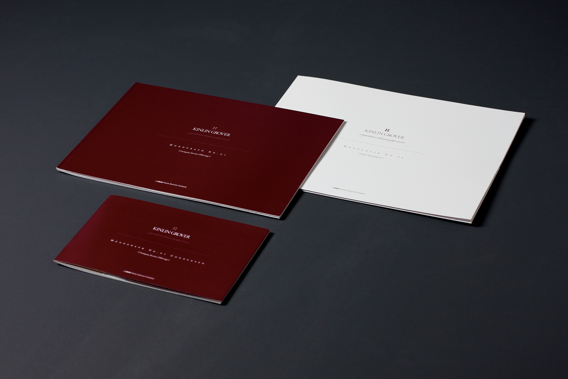
Home Buyer and Home Seller Brochures


Brand Film: “Vignettes”

Brand Photography



Custom Photography Library
Office Posters
Logo, Premium Properties Program

Coffee Table Book